Saturday, August 4, 2012

Lecture 9 - Objects mean more than you think

1. Explore this:
Every object tells a story if you know how to read it. Agree with it. Disagree with it. Explore our relationships with objects. How we have made them and how they make us. How each object including us have become communication technologies. How we are so obsessed with them and how we are becoming objectified by the meaning we put in them. You can look at context (if you know how to read it). Use different media within the blog to express your thoughts in the most appropriate way.

A brand is a "Name, term, design, symbol, or any other feature that identifies one seller's good or service as distinct from those of other sellers." Branding began as a way to tell one person's cattle from another by means of a hot iron stamp. A modern example of a brand is Coca Cola which belongs to the Coca-Cola Company.


Objects, when put together with a brand, become more than just mere objects. We identify with these objects because they have been designed to communicate with us - be it a deliberate attempt or not. We engage our senses when evaluating the object and figure out how it is used, and how we can relate to it. Humans are inclined to establish communication to draw meaning and make sense of things because it is in our nature to do so.

As we explore the issue of objects becoming communication technologies, the following 3 brands will be the focus of our discussion, as we feel that these are iconic in communicating beyond their tangible aspects: Tiffany & Co., Rolex, and Nike.

Tiffany & Co.
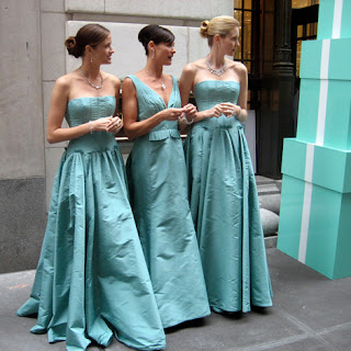
The world today recognises that particular shade of robin egg blue as The Tiffany blue. Interestingly, this blue with the patented Pantone number 1937 coincides with the year Tiffany & Co. was founded. In colour psychology terms, turquoise represents communication, creativity, modernity and a forward-thinking stance.


The little blue box
What Tiffany & Co. is attempting to put across to its consumers is that it is a brand of excellent craftsmanship and exclusivity, and people who buy its products as a gift care enough to purchase something special.

Imagine this scenario: You are having dinner in a room lit by only soft candlelight. The ambience is romantic but the dim lighting tones make it hard to see as well. You look up from your seat and across the table. Amidst the blurry shapes of cutlery and wine glasses you catch sight of that blue packaging, and breathe in deeper. Your heart rate flutters and you hear yourself silently whisper "Tiffany’s" before the other party even presents the gift to you.

The positive emotional responses evoked by glimpsing the sight of the blue box during the gift giving process have a very real and significant value, often tied with romantic connotations.

The ‘Tiffany blue’ color has come to symbolize Tiffany itself. But the company’s success does not just owe it to their product packaging of their signature blue box and their blue jewelry pouch. It is also the strength and endurance of the Tiffany name.


It is also rumoured that the particular tone of colour may have been chosen because of the popularity of the turquoise gemstone in 19th century jewelry. Turquoise was also a favourite of Victorian brides, who gave their attendants a dove-shaped brooch set in turquoise so that they would not forget the bride. This extends a strong nuptial association with the colour; many weddings today are themed around that colour, and some do not even require the actual use of a piece of jewelry from the brand.


The movie which placed Audrey Hepburn as one of the greatest style icons of all time, Breakfast at Tiffany’s, starts off with her character standing outside the Tiffany & Co. boutique at Fifth. The romantic nature of the story, which explores various kinds of love, further illustrated Tiffany & Co. as a tangible representation of positive emotional feelings like love and happiness.


“Time rolls on and youth is gone,
And you can't straighten up when you bend.
But stiff back or stiff knees,
You'll stand straight at, Tiffany's...”

Marilyn Monroe also repeats Tiffany’s a couple of times in one of her trademark songs in the movie Gentlemen Prefer Blondes. The lyrics of this song center around how different things may fade but diamonds will always stay the same, making it a “girl’s best friend” - the fact that she included Tiffany & Co. in the song rather than other brands shows how Tiffany & Co. is used to represent timeless luxury.


Due to the constant hammering of these ideals across various media over the years, Tiffany’s has become synonymous with jewelry that stands a class above the rest. This translates into an identity, one that proposes that if one is seen wearing Tiffany & Co. jewelry, then they would be deemed more stylish, and more appreciative of quality and luxury. This perception-based image is exactly what the brand aims to communicate; so much so that “It is every girl’s wish to receive a little blue box from Tiffany’s.”

Rolex
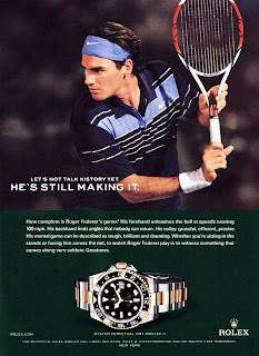
Rolex is a luxury brand with a well-established reputation of manufacturing high-quality wristwatches. These bespoke watches are undeniably one of the most prominent forms of status symbols, even today. Transcending a mere object worn on one’s wrist to keep track of time, a Rolex timepiece holds much more importance in the creation of an image often widely associated with a worthy investment and high status.

In the beginning, Rolex gained recognition as they were to first to manufacture the waterproof and dustproof wristwatch “Oyster” in 1926. Another notable innovation of the watchmaker was the fact that it was the first ever watchmaker to receive chronometer certification for a wristwatch.


It serves well


The constant innovation and high-quality of Rolex watches was one of many reasons that propelled the brand to prominence. Furthermore, the Rolex watch has always been associated with men and women of status and power. By the beginning of World War II (WWII), Rolex had already gained such prestige as a luxurious maker of watches, that it was even the preferred choice used by British Royal Air Force pilots, who eschewed inferior standard-issue watches.
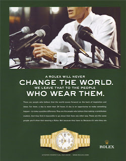
Rolex promises that the world is our oyster


Today, one owns a Rolex timepiece with the intent to portray themselves as well-heeled, affluent, individuals that pursue higher quality things in life. It is indicative of a lifestyle, an attitude, and even the owner’s status in society, although these can be a fabrication and/ or inaccurate representation of the truth.


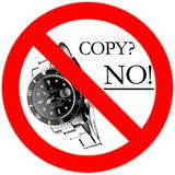
Counterfeit goods are a good way that exemplifies how we perceive and use objects to communicate certain values intrinsic to those objects. Because of how we pine for these luxurious objects, and the inherent status they confer to us, people who could not afford a real luxury timepiece by Rolex often purchase counterfeit versions of the watch, at a fraction of the price. Unless exposed by someone who can tell the authenticity of the timepiece, anyone would be able elevate his status and portray himself in a manner that he wants to others to see him.

Nike

The name "Nike" was taken from the Greek and it means "goddess of victory." The logo represents the wing of the Greek Goddess. In the world of brands, Nike is definitely a victor. Nikes uses a simple logo, a great slogan (JUST DO IT) and a list of superstars including Michael Jordan, LeBron James, Andre Agassi, Shane Warne, Maria Sharapova, and Venus and Serena Williams to promote their sales.
The original swoosh.


The slogan (JUST DO IT) has been introduced in the late 1980s and became an instant success and remains a popular branded slogan even twenty years later. On the other hand, the logo (Swoosh) has became Nike’s signature. With or without the word Nike underneath it, the general population can see the swoosh and visualize Nike. The logo is the heart of an organization’s identity, as well as to persuade visually. The swoosh simultaneously represents athleticism, competition and victory. With one solid brush stroke, viewers of the swoosh know that this is what it means. Yet Nike's audience does not notice this at first upon sight of the swoosh because "visual communication is always coded and seems transparent only because we know the code already, at least implicitly".

Nike produces a wide range of sports equipment. There are different types of Nike shoes that are catered for different purposes. For instance, Blazers, Air Max, Court Classics and etc. The brand is well-known and popular to the youth culture, chav culture and hip-hop culture for their supplying of urban fashion clothing. Nike has also teamed up with Apple Inc. to produce the Nike+ product that monitors a runner’s performance via a radio device in the shoe that links to the Ipod Nano. This made it easier for runners to keep track of their performance and at the same time, being able to listen to music while running.


Nike has strongly believed in bringing inspiration and innovation to every athlete in the world. And what Nike meant by athlete is, “if you have a body, you are an athlete”. Their mission has reflected in their advertising as well. Nike makes use of “real women” in their print advertisements. These advertisements showcase what seem to be real women and highlight a specific part of their body. According to USAToday.com, the ads show “a mix of pro athlete models and real women appear in ads with shots of their legs, butt, hips or arms. The fit women are unapologetic about what they call their ‘big butt’ or ‘thunder thighs.’” Spokesperson for Nike, Caren Bell, comments that, “The ads try to illustrate that 'not all body types are created equally. To be a woman athlete, fit and strong doesn't mean you have to be sample size." These Nike ads play on women's insecurities, yet displays them in a way that empowers the female.


Nike prides itself in creating state of the art athletic equipment from running shoes to soccer balls and using a logo that rhetorically represents success and visually ties into the ancient gods of sport explains its success as a successful, simple and recognizable trademark. The visual rhetorical tactics that Nike used (semiotics, gender, narrative representation and spatial experience) has led Nike today to be an effective brand.


++

In our post-modern society that we live in today, we are but disparate individuals each seeking to form his/her identity. Our identity makeup, often guided by what we perceive around us, is now easily “designable” by what we choose to purchase and show off. We can now shed identities like how a snake sheds its skin, and we have created objects so loaded with perceived meaning, that they speak to us on many levels.

As we delineate ourselves through our purchases in our consumeristic culture, we have become an evolving micro-organism that literally works at creating objects, so that we can afford to buy the very same objects, in order to craft our very personal uniqueness.

In short, as we consume objects, so do they consume us.

Friday, August 3, 2012

Lecture 7: Radio affects us most intimately

Lecture 6: Photography

1. How does a photograph “elevate the ordinary to the extraordinary”? Relate this to your current task of documentation.

To say that photography elevates the ordinary into the extraordinary refers to how photography can place something routine into focus. For instance, a photographer can take a photo about water trickling down the drain in one’s bathroom sink; with an aim to make others think about something they often take for granted. This notion of “focus” was further illustrated with our task of documenting how we look like in the mirror every morning for five consecutive days. Waking up and checking our physical appearance in the mirror is something most, if not all, people do on a daily basis, so much so it becomes one of the involuntary habits that has been drilled into us. Adding the camera into the equation, we become acutely aware of this habit, making it a special event of our day since it will be recorded and saved somewhere forever. The camera also provides the audience with the point of view of the photographer taking the picture, that is, how he/she sees themselves in the mirror every morning.


According to http://acrossthestairs.tumblr.com/, “What makes a photograph extraordinary is that it captures everything.” The technology of the photograph also allows every detail in the picture to be communicated. Erven if the focus of the photograph was of a plate of food, details like the design of the cutlery, the tablecloth and even the type of lighting would be captured as well. This allows tiny details normally unnoticed by people to become significant.


The photograph is therefore neutral. However, while the medium is neutral, the act of documenting it isn’t. This brings us to the point of how the same photograph can mean different things to different people when put in different contexts. In a food blog, the plate of food in said photograph would be the focus to the audience. Yet, if the photograph was placed in an IKEA catalog, the audience would be focusing on the tablecloth or the china used.

What makes photography so special as compared to other inventions like the typewriter, is its ability to freeze a specific moment, essentially putting a scalpel to time. This characteristic of the camera creates the element of immortality for the subject, thus allowing a moment like your child’s first steps to be re-lived. The photograph thus essentially takes us into a whole new realm. It preserves something from the incessant flow of time and transforms it into a powerful, focused viewpoint with subjective connotations.

You'll have the world at your feet with photography.

With the camera in our lives, people now tend to look out for more perspectives in our daily lives that is worth capturing.  

2. How is the photograph part of our (or your) vernacular? Examples?When we talk about the use of photographs as a part of our daily expression and language, there is no way we can veer away from the social media platforms that we use. More so, it is becoming a more common and creative way to tell people what we want to express, using pictures to either aid our words, or substitute them completely. Take Twitter for example. The word limit of 140 characters allows its users to only say so much. The image uploading function gives the user an opportunity to express oneself without having to tweet a word, rather leaving it to open interpretation the meaning that the photograph encapsulates.


Similarly, Facebook Timelines are a witness of the prevalent use of images are part of our vernacular, whether we do it subconsciously or not. People upload and share images that document their daily activities, travels, and special events onto Facebook, for reasons beyond mere documentation. Photos are uploaded almost as soon as they are captured, all thanks to the almost ubiquitous ownership of smartphones with cameras.
We create snapshots for various reasons. We want to show people how interesting our lives are, what we are up to, and sometimes, to let people who view our photos understand what we are like. It eliminates the need to explain the situation in words, the need to verbally say, “Look how interesting my life is”, or simply, “Pay attention to me. I’M SPECIAL!”. 

The subtleness of photographs in conveying what people want to express, as well as the convenience it brings us, makes them such a popular and common medium to communicate these days.


Communicative technologies that connect people in different countries also make use of visuals to make it more effective and ‘real’. Facetime, a very popular Apple technology, allows users to make video phonecalls that allows parties to see and hear each other conveniently. The conversation therefore gains a new dimension as body language, facial expressions, and even the surroundings of each user can be seen by the other party.


After the rise and success of Google, people now refer to the act of searching for information online as “Google-ing” it (i.e. “Let me Google that.” instead of “Let me search it up online.”). The search function has become, literally, the process, adding a new word into our vocabulary. Similarly, with photographs, we’ve incorporated words like Polaroid, and more recently Instagram, and we have become so familiar with using them that they have started to take up a big part of our lives. Walk into a restaurant and observe the people who have just had their food served to them - you will not see them digging in heartily but instead taking a picture of their meal and then hear them talk about “Instagramming” it.


Photographs also allow visual references to ease explanations. Go to the nearest newsstand and you can see magazines teaching people how to dress “Kate Middleton style”. There is no way the writer is able to fully explain what the Kate Middleton style is, but with the help of a candid photograph of the Dutchess, readers are able to distinguish her style from other fashion icons.


With cameras and their accompanying platforms of distribution becoming more prevalent, we continue to add new words into our daily vernacular. Will we become a world where we will Instagram our Picsart through Whatsapp or “flickr” our way into the future? I guess we’re just a snapshot away.

Lecture 5: Typeface and Documentation

1. Pick a typeface – Times New Roman (Times Roman) Produce a timeline of the typeface. From its inception to how it is used today. Show examples. Show off shoots. Show its ideals in use.
Brief timeline of the font:
1931 - Commissioned by The Times and created by Victor Lardent at Monotype 1932 - Debuted in The Times in 3 October
1933 - Released for commercial sale
1933-1972 - Used by The Times in its original form
1973-2004 - Variants of Times New Roman used in The Times
Since 1994, nearly all browsers have shipped with Times as the default font. It was replaced as the default font in Microsoft Office in 2007.


Times New Roman is also part of the Liberation Font.  A collective name of four TrueType font families: Liberation Sans, Liberation Sans Narrow, Liberation Serif and Liberation Mono. These fonts are metric-compatible with Monotype Corporation's Arial, Arial Narrow, Times New Roman, and Courier New (respectively), the most commonly used fonts on Microsoft's Windows operating system and Office suite. These fonts are permit free and open source software systems to have high-quality fonts that are metric-compatible with Microsoft software.
Times New Roman was such a popular font that it replaced 12 pt. Courier New as the default font used on all US diplomatic documents. This notable change took place in February of 2004, and now Times New Roman is a standard with even the US government.


Behind the Times?
Times New Roman – The Ideal Type
Times New Roman was designed for use in newspaper printing presses in 1932 and is not ideal for use in a modern printed book anymore. It was created to be used primarily in print and therefore looks typographically antiquated. Times New Roman is still frequent in book typography, particularly in mass-market paperbacks in the United States. Especially because of its adoption in Microsoft products, it has become one of the most widely used typefaces in history.

The name “Times New Roman” was used because the former font of The Times was called “Times Old Roman”. It was based on another typeface by Morison, called ‘Plantin’, but revisions were made to make it more economical in terms of space and to increase legibility. Times New Roman is still widely used in book typography, and b
ecause of its popularity, the typeface has been influential in the subsequent development of a number of serif typefaces both before and after the start of the digital-font era. One notable example is Georgia, which has very similar stroke shapes to Times New Roman but wider serifs.

Times New Roman lends itself for body text in any publication that needs to have a classic yet practical look. Combining excellent legibility with good economy, it is used a lot for books and newspapers. Times New Roman is not very suitable for on-screen usage although it is one the web-safe fonts judged to be available on every computer worldwide.

The ubiquitous nature of Times New Roman has made it an ideal choice for situations where fonts can’t be embedded. It’s also highly readable, even at smaller sizes. Times New Roman is best suited for body copy, both online and off.

Times change, but also stays the same
Times New Roman is still widely used today, though many have cited it being “stuffy and boring”, “belonging to an older age” due to its usage in print media and government agencies. Just like Helvetica, Times New Roman was created with the intent of legibility. In text blocks, it was concluded after much study that it was easier to read a font that had serifs in the upper and lower case. "Sans serif" fonts (fonts without serifs) such as Helvetica and Ariel are difficult to read in large text blocks so they would be automatically less ideal in long newspaper columns or book pages.


2. As a group, choose something to document. With the camera you have with you document it. Document it until Wednesday. Pay particular attention to your act of documentation (include you? Separate you? How does it affect your decision/s as you are aware of your act of documention?)


I have always been a very conscious person, and this series of documentation has made me more particular about the way I go about taking photos in the mirror. Although a few of my photos are taken with just my bare face on, my face is still covered because of the angle I took the photos from. Initially, I felt really strange on the idea of having to show strangers how I look like in the mirror for consecutive 5 days but as the days pass, I tried to stop being less self-conscious and took a few of the photos when I was just about to hit the sacks. I realized then, if I were to prepare for a shot every single time (make-up on and dressed up), it would not be as 'real' and 'raw' as I wanted it to be.

This series of documentation represents my early mornings. Before my morning coffee, i am unfriendly and highly irritable. These photos show that I am wearing sunglasses which serves two main purposes - hiding and not wanting to talk to anyone, and protection from the harsh morning sunlight. I feel involved when i take these photos because i am suddenly aware of how i look like to fellow morning commuters, and as the project progressed i felt the need to take 'better' pictures - even if it was early and i was feeling tired. This has been a very interesting documentation project, I plan to keep on documenting my mornings and maybe evenings as well to compare any inherent difference.

Ever since my school timetable in poly started to be more flexible than the 8am to 5pm of secondary and primary school days, I stopped being a morning person altogether. Documenting my appearance in the morning just added on to another reason why I find preparing for the day in the morning so troublesome. Yet, through this act of documentation, I realised that as much as I can be pretty nonchalant about my appearance, with the camera in the picture (no pun intended), I am just as self-conscious as anyone out there - it can be seen that my face is mostly covered in the pictures. I also stopped documenting on the 4th day because my house underwent renovations and I felt conscious about not only myself but my surroundings as well. This documentation process made me realise how much is put into consideration when people record something with the camera but also made me ponder - so how real is reality TV then?

The deliberate action of documenting my first look every morning has made me more conscious about myself, and even the environment. I had never noticed how dirty my mirror was until I had to photograph my mirror reflection and review the photo daily. When I had the patience, I would take a few shots and choose the most satisfactory one. I realised how I felt bothered that strangers would be able to see what I look like in a home-environment.


As a group, we decided to document our first looks into the mirror every day for 5 days. With the introduction of the medium (camera), I could no longer simply go through my mundane morning preparations without affected to a certain degree. As the series of shots progressed, I was more concerned about how I looked on camera, and began to unconsciously "pose" for the picture. this "inclusion" into the process made the morning ritual "special". It was also weird that this documentation also "excluded" me from the act with the introduction of the "other", even though the "other" was myself.

In conclusion, we all felt conscious and more aware of ourselves as the documentation progressed. We felt involved with the photo, mainly because we are in it, and therein a highlight in the way we want to portray ourselves in the photos taken. It was a pretty risky decision to document ourselves because it is an intimate act, even if we are alone with our phones or cameras, and the mirror.